MY ROLE
With this big project I was lucky to have the support of a UX Manager out of our Chicago office that came to Singapore for the duration of the project - We leveraged his telco experience and worked closely with our colleagues in India to push the experience forward. This was one of the bigger engagements I’ve been involved with and over the course 6 months our team of 5 UX Designers, 2 Designers and our Creative Director had our hands full.
Apart from focusing on the user experience during this project, I also assisted in estimating, planning and course-correcting the project as it played out.
THE CHALLENGE
HELP US THINK BIG AND SHOW OUR AWARD WINNING STYLE
SingTel has over 130 years of telecommunications history and has played a significant role in Singapore's development as a major communications hub. Their brand promise "Amazing things happen when you think big” resonated in the market and in 2011 alone SingTel picked up awards, to mention a few, for Best Mobile Operator, Best Internet provider and Best Start-Up program. This award winning attitude and big thinking was nowhere to be seen in their online presence.
SingTel asked SapientNitro to help them THINK BIG and push their user experience. They were also looking to integrate their 5 disconnected shops and boost their e-commerce capabilities to increase sales, service and engagements online.
The current experience had some improvements to be made.
A BIT ABOUT THE COMPANY
SingTel provides a diverse range of communication services and solutions, including fixed, mobile, data, Internet, info-communications technology, satellite and pay TV and has a big presence in Asia and Africa with more than 400 million mobile customers in 25 countries, including Bangladesh, India, Indonesia, Pakistan, the Philippines and Thailand.
THE APPROACH
FOCUS RELENTLESSLY ON YOUR CUSTOMERS
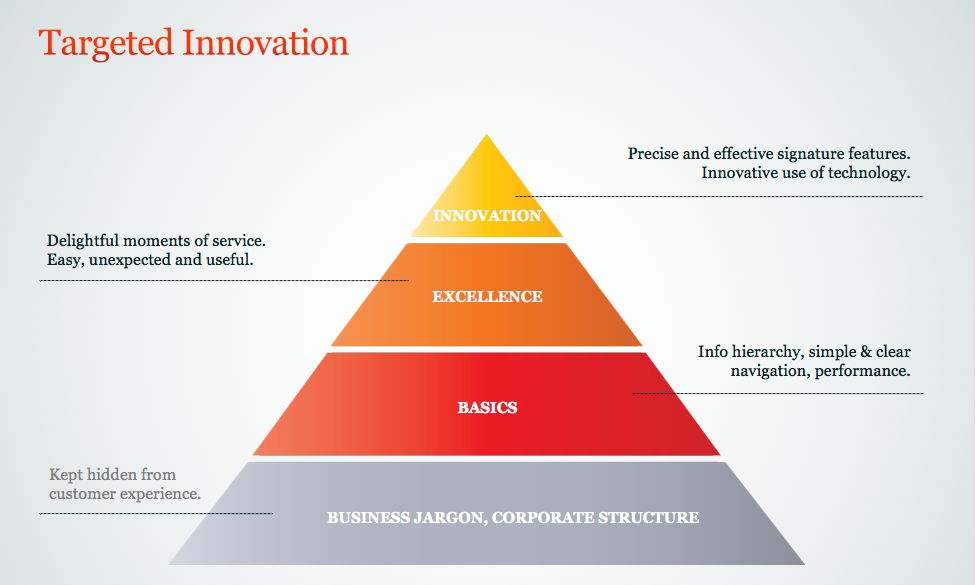
Delivering on the brand promise is about doing the little things in ways that delight customers - in those moments that really matters to them.
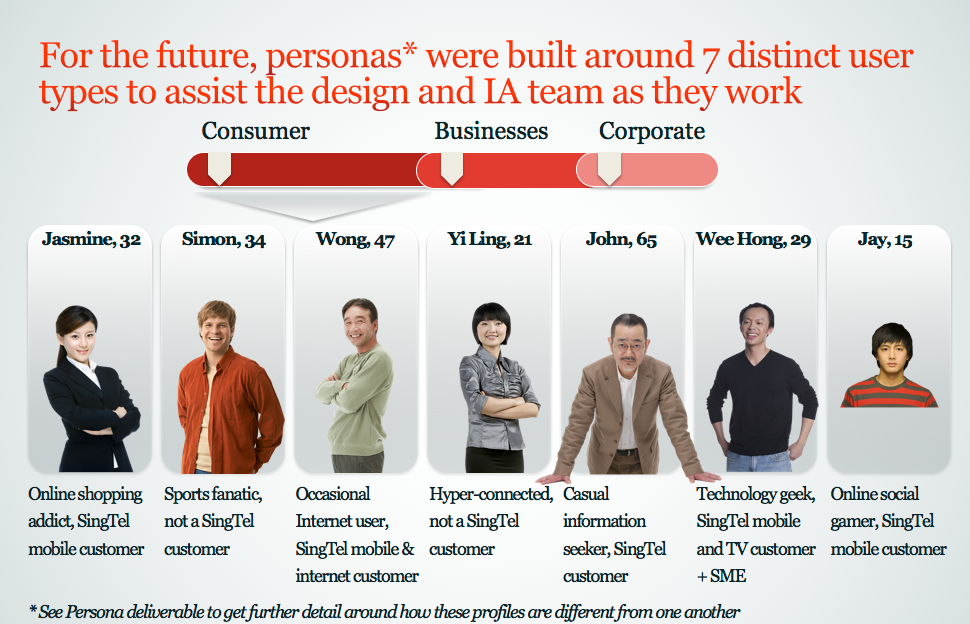
We knew that SingTel serves s wide range of customers across Personal, Business and Corporate offerings and that these customers will be at different stages of their interactions with SingTel, considering different products or services. Significant work was done to understand these customer needs, their journeys online and what their goals were. This work was done by a designated Researcher/Strategist and served as input for the UX and Design teams.
For this portfolio I will only share snapshots of deliverables I was involved in and therefor just share a summary of the personas and innovation principles that served as our foundation.
UX DELIVERABLES - A SNAPSHOT
The project was divided into a 7 week Discovery phase, directly followed by a 16 weeks Detailed Design phase.
Below you'll find highlights of some of the deliverables and activities I was involved in.
Below you'll find highlights of some of the deliverables and activities I was involved in.
DISCOVERY PHASE
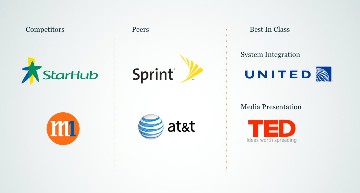
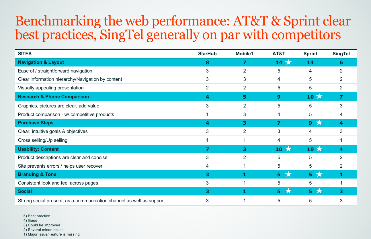
In this phase of the project I ran a review across both local and global competitors as well as category disruptors in media presentation and systems integration.
This set our benchmark for the experience and allowed the team to have a joint foundation to work from.
This set our benchmark for the experience and allowed the team to have a joint foundation to work from.
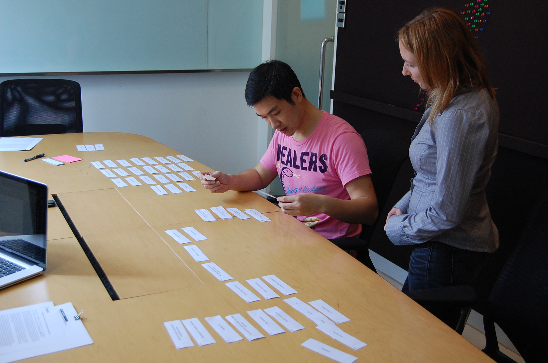
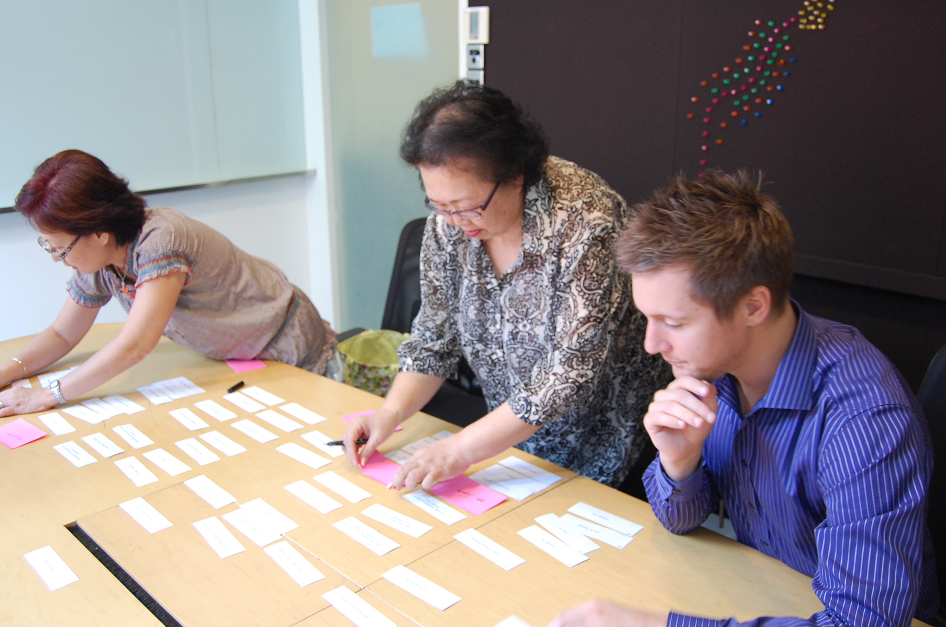
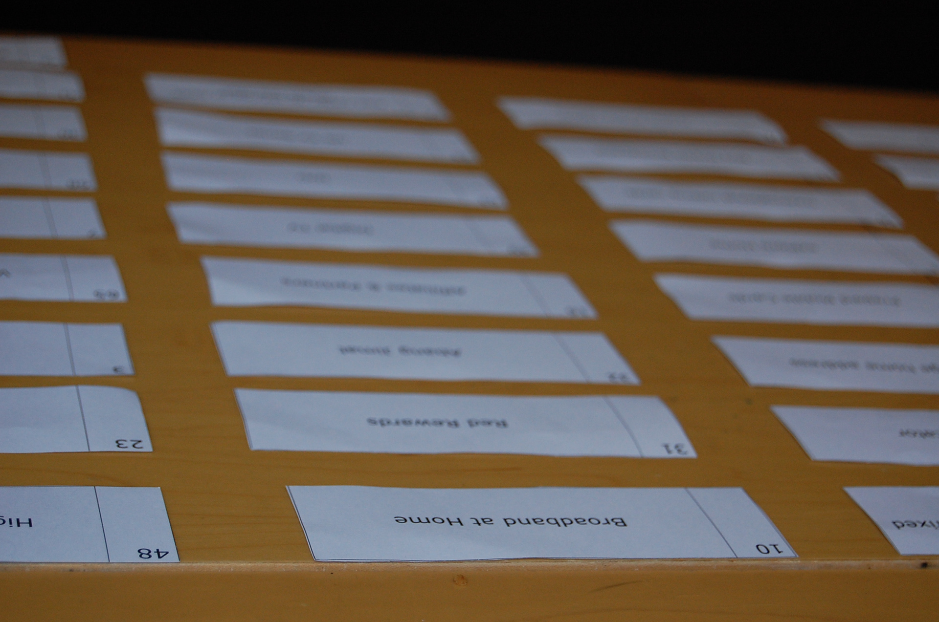
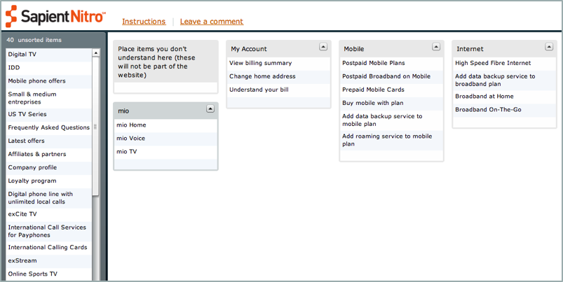
I also ran a series of card sorting activities (both face-to-face and online) to uncover content groupings and useful labels that would work for our new information architecture for the site.
At the end of Discovery we also formulated three Experience Principles to keep us on track and connected to the brand promise of THINKING BIG throughout the project.
THE JOY OF POSSIBILITY
Not just services, applications and entertainment, but the excitement and sense of possibility that SingTel promises.
Not just services, applications and entertainment, but the excitement and sense of possibility that SingTel promises.
WARMTH
A real space where amazing technology is experienced in the comfort of everyday life.
A real space where amazing technology is experienced in the comfort of everyday life.
PEOPLE
The power of personal stories brings SingTel’s passionate people and customers together.
The power of personal stories brings SingTel’s passionate people and customers together.
DETAILED DESIGN PHASE
During the second phase of the project I paired with a colleague in our Bangalore office and worked through the foundation of the e-comm flow starting with the Mobile/Plan journey, considering all variations within the sales flow (new or existing customer, considering phone or plan first, upgrading scenarios etc.) as well as each page’s objective and how they all worked together.
These detailed wireframes and flows then served as the foundation for the other products that the e-comm solution needed to cater for.
These detailed wireframes and flows then served as the foundation for the other products that the e-comm solution needed to cater for.
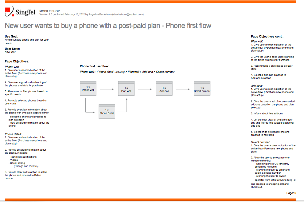

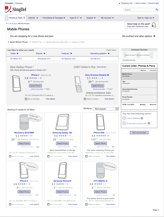
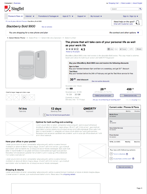
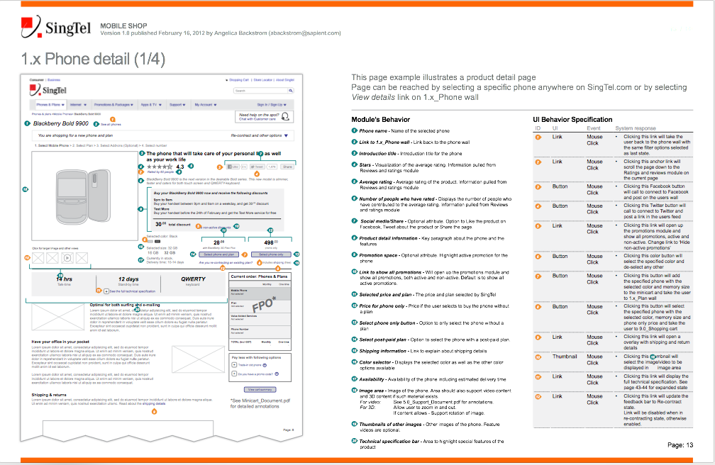
Other sections I focused on during the project were support, general content pages (templates and modules) and the homepage, building in personalisation and exploration as key drivers for the experience.
Collaboratively across 5 UX Designers we produced over 670 pages of annotated wireframes, flows and page examples split over 33 documents. Simply put, this was a massive project.
Wire snapshot
THE DESIGNS
I worked really close with an amazing designer and we both pushed each other's work for the better. He's one of the most talented designers I've worked with and if I had a chance to work with him again I'd do it in a heart-beat.
Below are some samples of his work and where the experience and design finally landed.
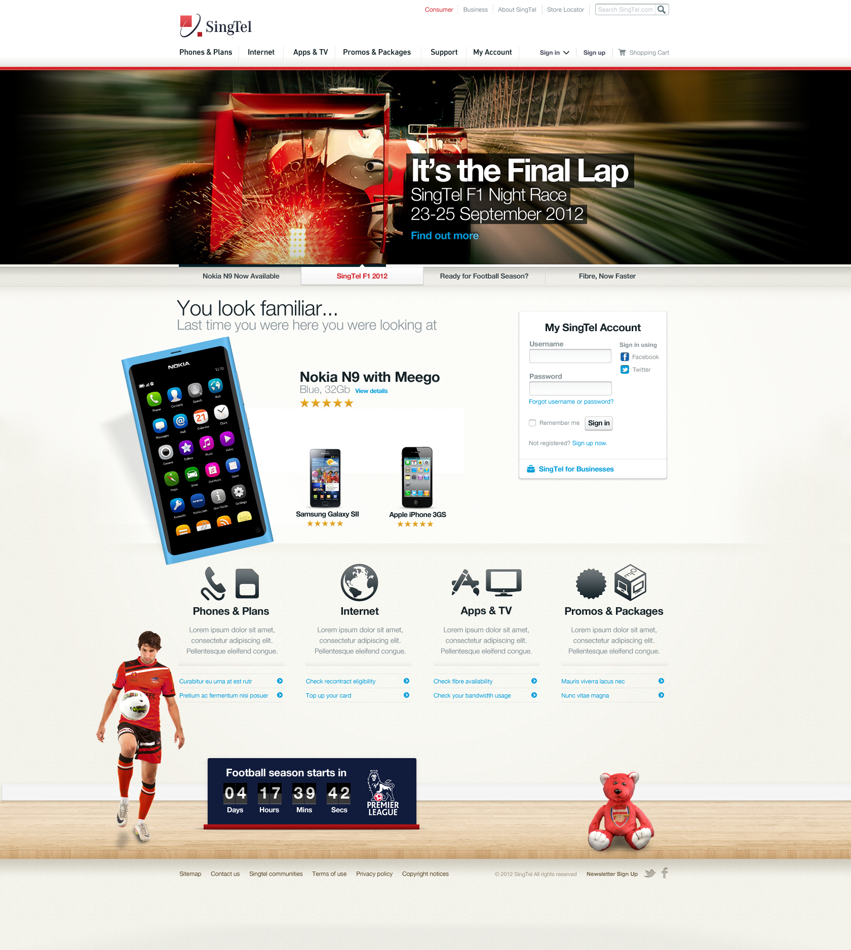
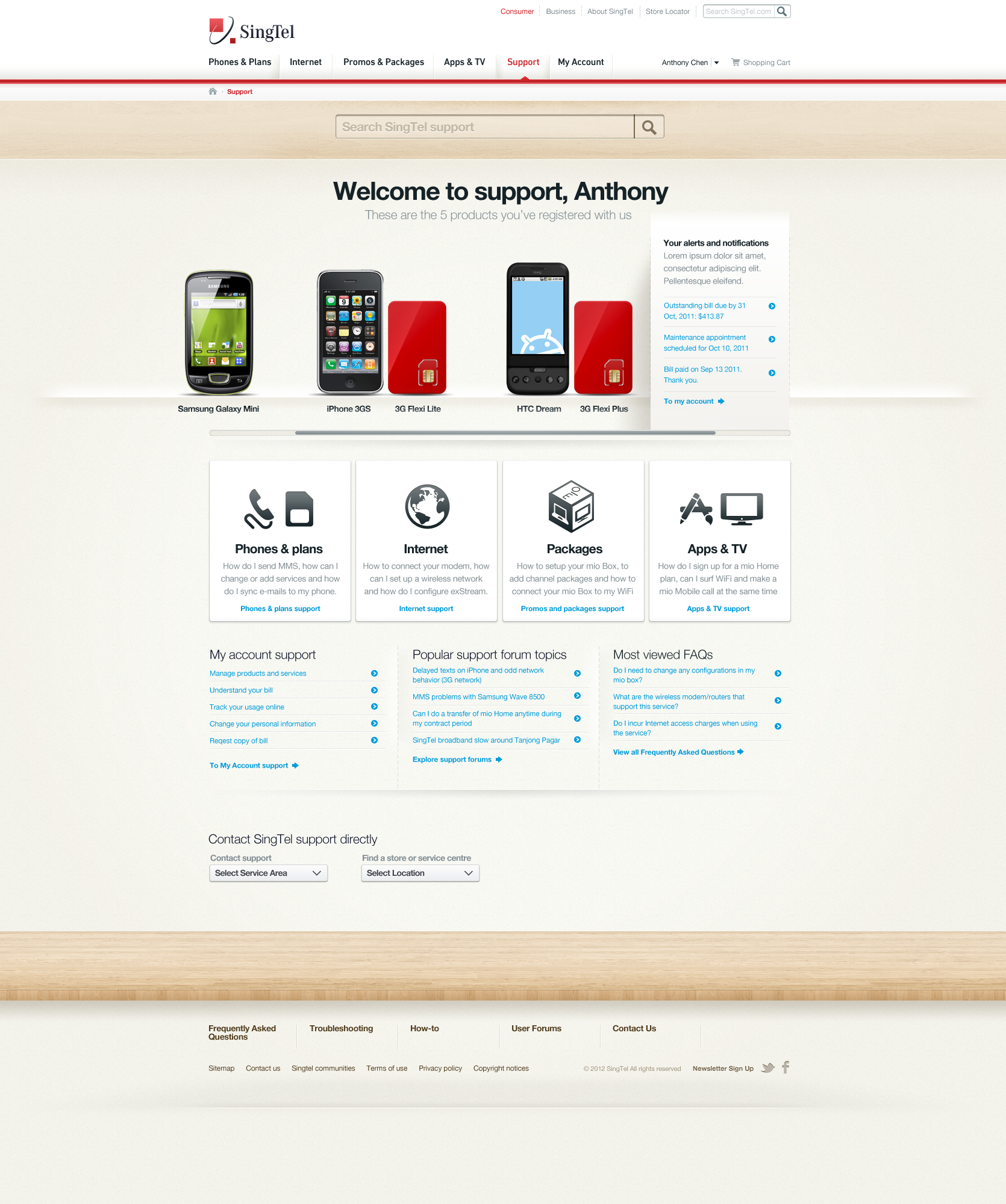
Playfully heroing the principles of The joy of simplicity, Warmth and People.
THE IMPACT
SINGTEL’S NEXT GENERATION PORTAL!
Even though the project stretched across many months of intense work, ran across multiple geographies and with complexities of multi-product and service streamlining - we delivered the project on time, on budget and to a very happy client.


